Orbitworks
A speculative social redesign, rebuilding a set of brand creatives against a single, disciplined visual system.
Orbitworks is doing something the region has never done before. It is manufacturing satellites in Abu Dhabi, building sovereign space capability for the UAE and exporting it to nations around the world. The story writes itself.
But scrolling their social feed, none of it was showing up. Each post looked like it came from a different company: inconsistent colours, mismatched type, event graphics that weren't branded at all. The visual system existed, but it just wasn't being applied.
So I asked a simple question: what if these posts actually looked like they came from the same brand? I rebuilt a set of their creatives against a single, disciplined visual system of one palette, one type pairing, and similar logo treatment, to show what consistent, ownable brand presence could look like.
1. Eurosatory 2026 Speaker Reveal
The original wasn't an Orbitworks asset at all. It was the event organiser's panel template, with five headshots dropped in and Orbitworks inaccurately represented in the design. A speaking slot at a global defence exhibition is a milestone. It deserves an asset that the brand actually owns. So I built one.

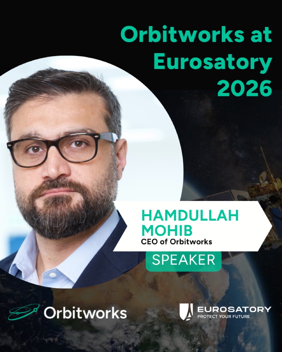
The CEO against a satellite-over-Earth still, fitting the company, with the name and title locked into a clean chevron in deep black and Orbitworks teal. Crucially, I kept the Eurosatory logo in the frame. Co-branding with the exhibition borrows its credibility and signals scale, while the brand's own colour, type and logo keep the moment firmly Orbitworks. It turns a shared panel slide into a milestone the brand can own.
2. Radio Interview Announcement
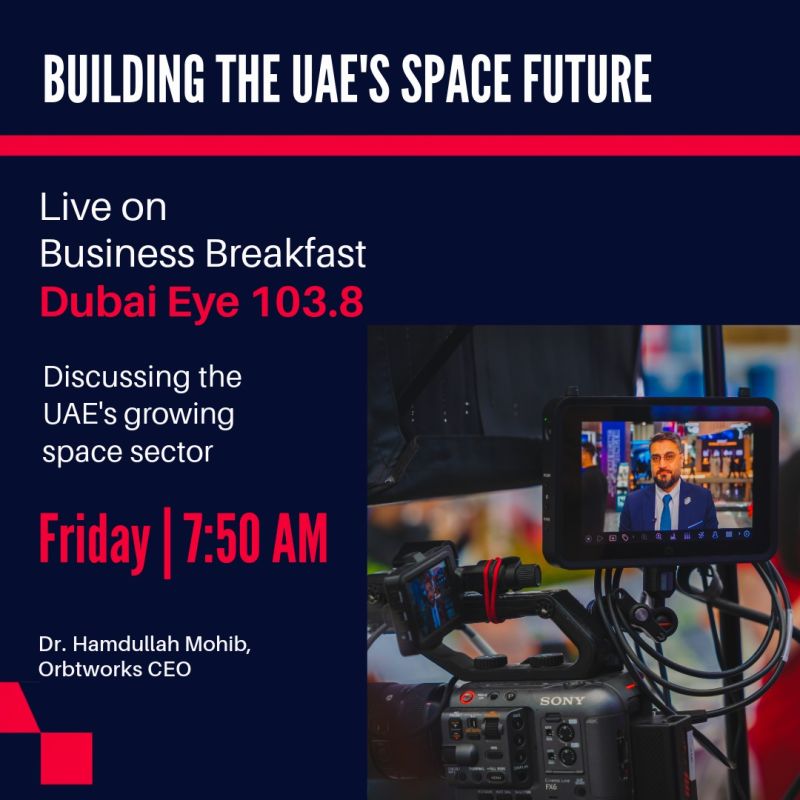
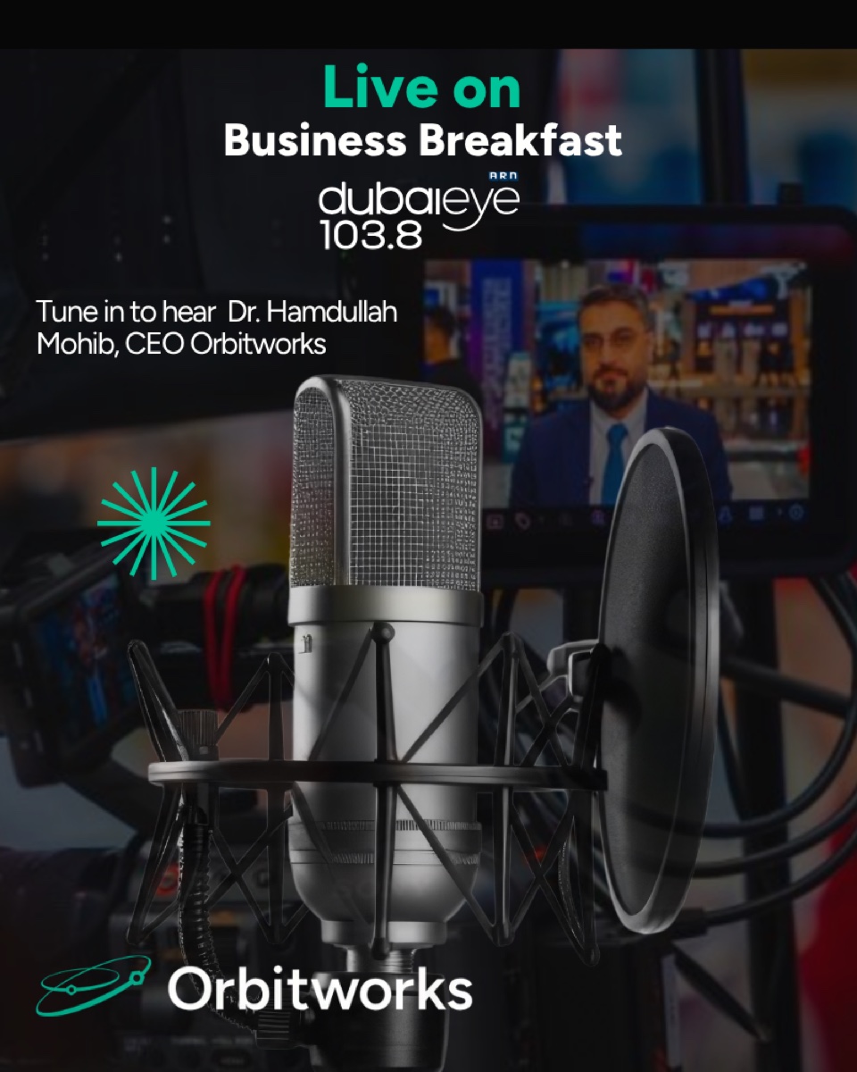
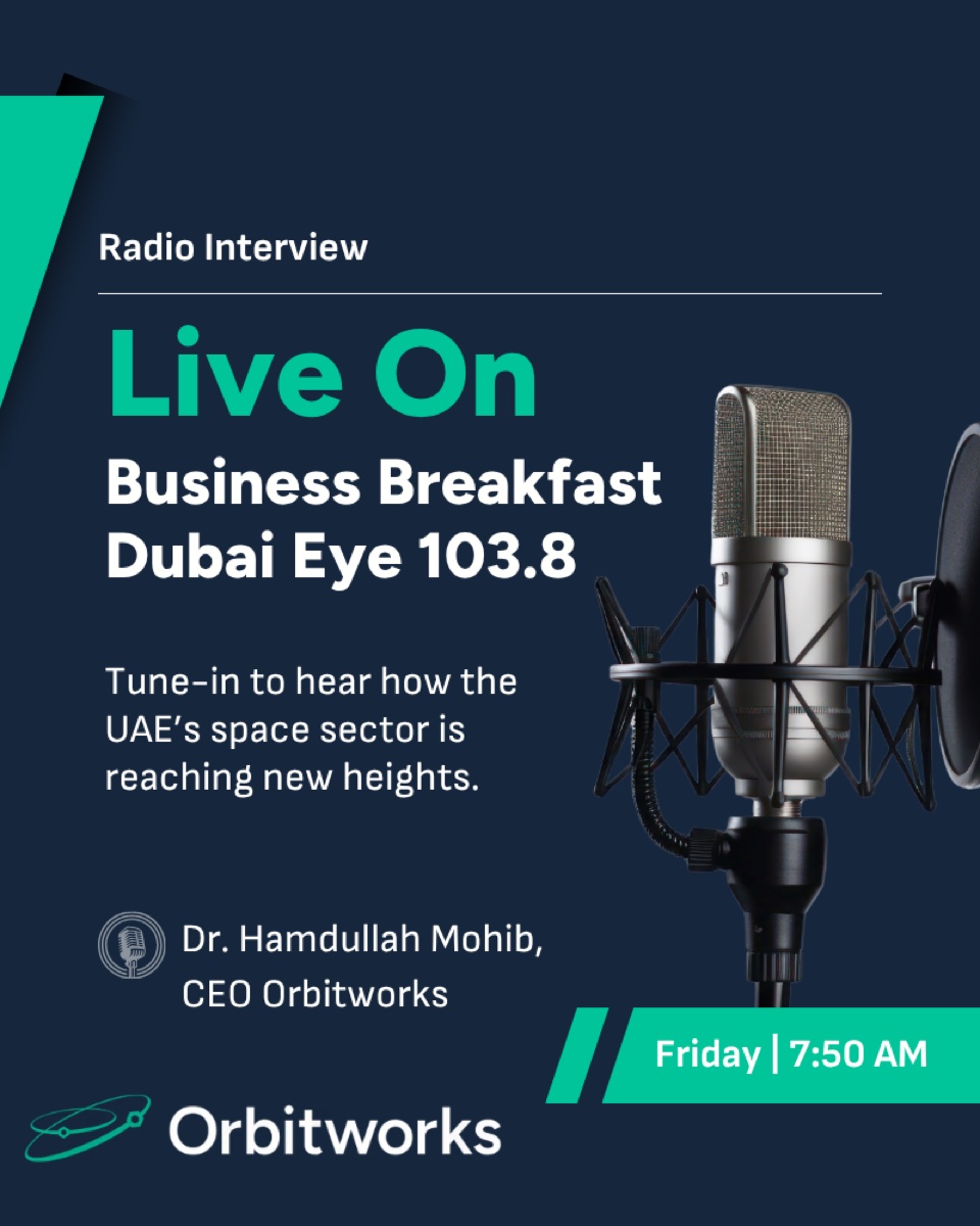
The same principle applied to an on-air appearance: an announcement rebuilt so it reads instantly as Orbitworks, from a distance and in the feed, rather than as a generic media graphic. This one went through two passes: a first iteration that established the on-brand direction, then a refined second iteration that tightened the hierarchy, type, and chevron detailing.
3. Festive Wishes
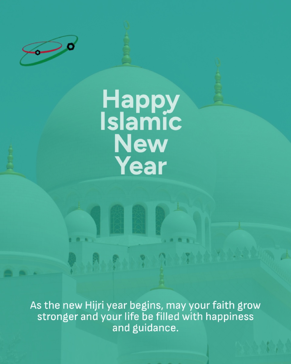
Festival greetings are easy to over-decorate, and easy to treat as throwaway one-offs, which is exactly why they so often drift off-brand. The original leaned on dense, ornate embellishment, with layered elements competing for attention. The redesign takes the opposite approach: a clean, single-focus layout with clear hierarchy and room to breathe, so the message reads instantly in the feed. The same warmth, far less noise.

The takeaway
A visual system only works when it's applied. By holding every asset to the same palette, type, and logo treatment, individual posts stop looking like scattered one-offs and start compounding into a recognisable, ownable brand presence.